Showing posts with label Robert Shiller. Show all posts

Tuesday, January 29, 2019

The Haitian dollar


Haiti is home to a strange monetary phenomenon. Shopkeepers and merchants set prices in the Haitian dollar, but there is no actual thing as the Haitian dollar.

I've written before about an exotic type of unit-of-account known as an abstract unit of account. A nation's unit of account is the symbol used by its citizens and businesses to advertise and record prices. Here in Canada we use the $ while in a country like Japan people use the ¥. The national unit of account almost always corresponds to the national medium-of-exchange. In both Canada and Japan, the $ and the ¥ amounts advertised in shop aisles are embodied by physical dollar and yen banknotes and coins.

Abstract units of account, on the other hand, don't correspond to anything that exists. In the UK, for instance, race horse auctions are priced in guineas, a gold coin that hasn't been minted in over two centuries. The guinea is a ghost money, an accounting unit that according to John Munro is "calculated according to the precious metal content of some famous, once highly favoured coin of the past than no longer circulates."

Other examples of abstract units of account include include Chile's Unidad de Fomento, or UF, (which I wrote about here) and Angolan macutes (see here).

Like the guinea, the Haitian dollar is an abstract unit of account. I should warn you that I've never been to Haiti--all of this comes from what I've read in tourist guides, newspapers, Haitian blogs, and an academic paper on the topic from Federico Neiburg. But from what I understand, it is quite common for prices in Haiti to be set in a unit referred to as the 'Haitian dollar.' However, there is no corresponding Haitian dollar banknotes or coins. The U.S. dollar and the Haitian gourde, a currency managed by Haiti's central bank, circulate in Haiti and are used to consummate all payments. But the Haitian gourde is not the same as the Haitian dollar.

How does this work in practice? Say that a restaurant is selling sandwiches for fifteen Haitian dollars. Paying with Haitian dollars is impossible--they don't exist--so some other route must be taken to complete the deal. Haitians have spontaneously adopted a rule of thumb that the Haitian dollar is equal to five Haitian gourdes. So to pay for the sandwich, it will be necessary to hand over 75 gourdes (H$15 x 5$H/HG).

Here is a sign showing both Haitian dollar and Haitian gourde (HTG) prices. Source: Pawol Mwen blog

A certain degree of mental gymnastics is thus required of Haitians, since sticker prices must always be multiplied by five (to arrive at the gourde amount) and banknotes held in a wallet divided by five (to arrive at the Haitian dollar amount). For foreigners, this can be confusing, but for Haitians the motley of U.S. dollars, gourdes, and the Haitian dollar unit of account has become second nature. Says Nieburg:
"The adjective Haitian (aysien), as in dolà aysien, is only used when one of the participants in a transaction is foreign. Among Haitians, when people say dolà they always mean dolà aysien."
Nieburg provides some more colour by describing the monetary demographics of Port-au-Prince, Haiti's capital:
"...in the urban islands of foreigners scattered across various regions of the city, the US dollar predominates as a unit of account and means of payment in sectors such as the housing market, as well as in restaurants, hotels, night clubs, and supermarkets (which used to double as currency exchange bureaus) that cater for upper-class Haitians and the legion of ex-pats, relief workers, and consultants. As we move down the social scale, the US dollar begins to be used as a means of payment for transactions calculated in Haitian dollars. Lower down—where the majority of transactions are to be found—people calculate in Haitian dollars and pay in gourdes."
Where does the practice of using the Haitian dollar come from? I wasn't aware of this, but during WWI the U.S. invaded Haiti, occupying it till 1934. There was a strong German mercantile presence in Haiti and apparently the U.S. authorities feared that Germany might take over.

By 1918 the government's gourdes had become "so worn and torn" that a shortage of banknotes arose. As part of a 1919 U.S.-initiated monetary reform, all previous issues of gourdes were to be replaced by a new issue by the Banque Nationale de la Republique d'Haiti, which by then was owned and controlled by New York-based City Bank (and would eventually become Citigroup). The BNRH was granted a monopoly on banknote issuance, which meant that the Haitian government could no longer print its own currency.

The new banknotes were to be convertible into U.S. dollars at a rate of five gourdes to the dollar, a promise that the BNRH printed on the face of each bill, as the images below illustrate.

1919 one gourde note (source)
 
"This bill issued by the National Bank of the Republic of Haiti, under its concession contract and conforming with the agreement of May 2, 1919, is payable to the holder in legal money of the United States at the rate of five gourdes to the dollar upon presentation to the bank's office in Port-au-Prince or, after a delay, at its provincial branches."

Even after the U.S. occupation ended and City Bank sold the BNRH back to the Haitian government, the promise to redeem gourdes with U.S. dollars continued. This peg stretched right through the rule of "Papa Doc" Duvalier until the gourde was finally untethered from the dollar in the late 1980s.

So several generations of Haitians had become used to a five-to-one ratio between U.S. dollars and gourdes. Dividing a price by five in order to get the U.S. dollar price may have become such a standard piece of mental arithmetic that the practice continued into the 1990s and 21st century, even after the calculation's answer no longer corresponded to the correct U.S. dollar amount. The Haitian dollar may simply have been a placeholder that was invented in order to provide continuity for the age-old custom of dividing by five.


Since it was unpegged, the Haitian gourde has fallen consistently against the U.S. dollar, possibly contributing to the tradition of using the Haitian dollar unit. Quoting prices in Haitian dollars could be a non-violent way for Haitians to show their dissatisfaction with their government's finances. Or perhaps it is a marketing trick that Haitian merchants use to make their wares seem less cheap, sort of like how shopkeepers here in Canada often set prices at $4.99 instead of $5.00.   

According to Nieburg, the government has even tried to ban the practice of pricing in Haitian dollars. Intellectuals who support the measure have condemned the abstract unit as just "another sign of the country’s backwardness." But the attempt failed. Units of account are just a part of language. And language is very difficult to control.

The Haitian dollar is probably the best (and simplest) modern example I've ever run into of an abstract unit of account. For monetary enthusiasts like myself, it provides a great illustration of the many different functions packaged into the thing we call "money." These functions needn't be unified into one object or instrument. They can be split up, so that the instruments that we pass from hand to hand (or from phone to phone), the so-called medium-of-exchange, no longer correspond to the symbol used for pricing, the unit-of-account.

Nobel Prize winning economist Robert Shiller has written enthusiastically about so-called monetary separation. William Stanley Jevons's tabular standard, which was never implemented but has been considered by some to be the ideal monetary system, relies on a split between the medium-of-exchange and unit-of-account. Rather than being backwards, the sort of Haitian dollar standard that we see in modern Haiti could one day become the guiding principle of the monetary systems of the future.

Tuesday, November 3, 2015

Why (not) rent your home?

Ted Nasmith, An Unexpected Morning Visit

"Why not just get a mortgage and buy the place rather than throwing money away on rent?" That's what people often say to folks like me who rent rather than buy. This post is my response.

Let me start off by saying that I'm neither a housing bear nor a bull. I have no idea which way Canadian real estate prices are going to go. My decision to choose renting over ownership has to do with other factors.

I don't have enough resources to buy a house or condo without getting a mortgage. Those who tell me I'm throwing my money away on rent and should buy are implicitly counseling me to take on a lot of leverage. Let's pretend that I'm comfortable accepting that level of debt. Why should I purchase a home with the borrowed funds and not buy some combination of the Vanguard Total World Stock ETF and the Total International Bond ETF?

To favor a home over the Vanguard ETF option is to assume that the risk-adjusted total return on the home exceeds that of the ETFs. Let's unpack this comparison a bit. ETFs provide a return that is purely pecuniary; some combination of price appreciation, interest, and dividends. Homes also provide a pecuniary return—they can appreciate in value. But a home is special. In addition to the pecuniary return, it simultaneously offers a non-pecuniary return, namely shelter. We can't eat in an ETF, or sleep in it, or entertain friends in it, but we can do these things with a house.

The total return on a home should be about equal to ETFs. Markets are competitive, after all, so if one asset offers an excess return, people will compete to harvest those gains, eventually arbitraging them away. Thus the total expected dividends, interest, and price appreciation from an ETF should be about equal to the sum of a home's expected price appreciation and the value of the shelter it provides. Shelter is a sizable service. This means that a home's expected life-time price appreciation needn't be very large to attract buyers. So an ETF's expected return will exceed a home's potential for price appreciation by a significant wedge. This wedge is the extra pecuniary return on ETFs held.

How big is the wedge? We can try to get a feel for it by looking at long term data. Using numbers compiled by Robert Shiller, I've calculated annualized real returns (i.e. adjusted for inflation) for both U.S. homes and equities going back to 1890. I don't have data that would approximate the Vanguard Bond ETF, and I don't know of any comparably long Canadian data series.


Equities, as represented by the S&P, have provided a real return of 6.5% per year including  price appreciation and reinvested dividends. Shiller's U.S. housing price index has yielded a much smaller 0.35% annualized real return over the last 120 years. Even if we omit the brutal credit crisis years of 2006-2015, U.S. homes still only provide a 0.54% return.

So when anyone boasts that unlike me they're not wasting money on rent, I accuse them of throwing away the extra wedge they could be earning by owning Vanguard ETFs.

Anyone who borrows to harvest the extra wedge on ETFs is left with a problem, however. They can't just sleep on the street, they need to acquire shelter. We're all born with a short position in housing. And that means giving up part of the excess wedge to a landlord. How much of this wedge? Again, since markets are competitive, my bet is that pretty much all of the wedge will have to be forfeited. If there was a significant chunk left over, everyone would choose to rent, driving rents higher until returns had equalized. At the end of the day, there probably aren't significant excess returns to be harvested by either home ownership or renting/investing in ETFs.

There are a few other stylized facts that colour the rent versus buy decision. Buying and selling a home will set you back thousands of dollars in transaction costs whereas it costs less than $25 to buy and sell ETFs. Secondly, a Vanguard ETF can be sold in a few seconds; a home can take weeks. Lastly, it costs just a few basis points to maintain an ETF (think management fees) whereas a house can cost thousands to keep in shape. To compensate for all these drawbacks (which are sizable), a home must offer a pretty high expected return.

What ultimately tips me towards the ETF option is the opportunity for diversification. Leveraging up on a single asset exposed to one street in a single city is a gamble. The two Vanguard ETFs, on the other hand, offer global exposure to thousands of different businesses, both large and small. Between renting and buying, renting seems to me to be the more prudent approach. I'm no gunslinger.

Which leads me in a meandering way back to Robert Shiller, specifically his derivatives markets for home prices. I'd certainly reconsider the home ownership route is if I could hedge away some of the risk of housing price declines, say by swapping out exposure to changes in the price of my home for a more diversified return. Most attempts to create housing derivative markets have failed, so until we have a futures market in housing prices, give me ETFs.

Wednesday, April 8, 2015

Liquidity as static


In his first blog skirmish, Ben Bernanke took on Larry Summers' secular stagnation thesis, generating a slew of commentary by other bloggers. If the economy is in stagnation, the econ-blogosphere surely isn't.

I thought that Stephen Williamson had a good meta-criticism of the entire debate. Both Bernanke and Summers present the incredibly low yields on Treasury inflation protected securities (TIPS) as evidence of paltry real returns on capital. But as Williamson points out, their chosen signal is beset by static.

Government debt instruments like TIPS are useful as media of exchange, specifically as collateral, goes Williamson's argument. Those who own these instruments therefore enjoy a stream of liquidity services that gets embodied in their price as a liquidity premium. Rising TIPS prices (and falling yields) could therefore be entirely unrelated to returns on capital and wholly a function of widening liquidity premia. Bernanke and Summers can't make broad assumptions about returns on capital on the basis of market-driven yields without knowing something about these invisible premia. (Assiduous readers may remember that I've used a version of the liquidity premium argument to try to explain the three decade long bond bull market, as well as the odd twin bull markets in bond and equity prices.)

Riffing on Williamson, liquidity premia are a universal form of static that muddy not only bond rates but many of the supposedly clear signals we get from market prices. Equity investors, for instance, need to be careful about using price earnings ratios to infer anything about stock market valuations. The operating assumption behind something like Robert Shiller's cyclically adjusted PE (CAPE) measure is that rational investors apply a consistent multiple to stock earnings over time. When CAPE travels out of its historical average, investors are getting silly and stocks are over- or undervalued.

But not so fast. Since a stock's price embodies a varying liquidity premium, a rise in equity prices relative to earnings may be a function of changes in liquidity premia, not investor irrationality. Until we can independently price these liquidity services, CAPE is useless as a signal of over- or undervaluation, a point I've made before. Hush, all you Shiller CAPE acolytes.

Liquidity also interferes with another signal dear to economists and finance types alike; expectations surrounding future inflation. The most popular measure of inflation expectations is distilled by subtracting the nominal yield on 10-year Treasuries from the equivalent yield on 10-year TIPS. The residual is supposed to represent the value of inflation protection offered by TIPS. But it is a widely known fact that this measure is corrupted by the inferior liquidity in TIPS markets. See commentary here, here, and here. The upshot is that a widening in TIPS spreads—which is widely assumed to be an indicator of rising inflation expectations—could be due to a degeneration  improvement in the liquidity of TIPS relative to the liquidity of straight Treasuries.

Interestingly, the Cleveland Fed publishes a measure of inflation expectations that tries to "address the shortcomings" of rates derived from TIPS by turning to data from a different source: inflation swaps markets. In an inflation swap, one party pays the other a fixed rate on a nominal amount of cash while the other returns a floating rate linked to the CPI. Given the market price of this swap, we can extract the market's prediction for inflation. According to the people who compile the Cleveland Fed estimate, inflation swaps are less prone to changes in liquidity than TIPS yields, thus providing a true signal of inflation expectations.

But how can that be? Surely the prices of swaps and other derivatives are not established independently of market liquidity. After all, like stocks and bonds, derivatives are characterized by bid-ask spreads, buyers strikes, and runs. Sometimes they are easy to buy or sell, sometimes difficult. When I first thought about this, it wasn't immediately apparent to me what liquidity premia in derivative markets would look like. With bond and equity markets, its easy to determine the shape and direction of the premium. Since liquidity is valuable, buyers compete to own liquid stocks and bonds while sellers must be compensated for doing without them. A premium on top of a security's fundamental value develops to balance the market.

Derivatives are different. Take a call option, where the writer of the option, the seller, provides the purchaser of the option the right to buy some underlying security at a certain price. In theory, the more liquid the option, the higher the price the purchaser should be willing to pay for the option. After all, a liquid option can be sold much easier than an illiquid one, a benefit to the owner. But what about the seller? I risk repeating myself here, but a seller of a stock or bond will require a *higher* price if they are to part with a more liquid the security. However, in the case of the option, the writer (or seller) will be willing to accept a *lower* and inferior price on a liquid option. After all, the writer will face more difficulties backing out of their commitment (by re-selling the option) if it is illiquid than if it is liquid.

This creates a pricing conundrum. As liquidity improves, the option writer will be willing to sell for less and the purchaser willing to buy for more. Put differently, the value that the writer attributes to the option's liquidity and the concomitant liquidity premium this creates drives the option price down, while the value the purchaser attributes to that same liquidity engenders a liquidity premium that drives the option price up. What is the net effect?

I stumbled on a paper which provides an answer of sorts (pdf | RePEc). Drawing on data from OTC options markets, the authors finds that illiquid interest rate options trade at higher prices relative to more liquid options. This effect goes in the opposite direction to what is observed for stocks and bonds, where richer liquidity means a higher price. The authors' hypothesis is that the liquidity premium of an option is set by those investors who, on the margin, are most concerned over liquidity. Given the peculiarities of OTC option markets, this marginal investor will usually be the option writer (or seller), typically a dealer who is interested in reversing their trades and holding as little inventory as possible, thus instilling a preference for liquidity. Buyers, on the other hand, tend to be corporations who are willing to buy and hold for the long term and are therefore less concerned with a fast getaway. The net result is that for otherwise identical call options, the overriding urgency of dealers drives the price of the more liquid option down and illiquid one up.

Anyone who has dabbled in futures markets may see the similarity in the story just recounted to a much older idea, the theory of normal backwardation. The intuition behind normal backwardation is that a futures contract, much like a call option, has two counterparties, both of whom need to be rewarded with a decent expected return in order to encourage them to enter into what is otherwise a very risky bet. If both require this return, then how does an appropriate "risk premium" get embodied in a single futures price?

None other than John Maynard Keynes hypothesized that the two counterparties to a futures trade are not entirely symmetrical. Hedgers, say farmers (who are normally short futures), simply want a guaranteed market for their goods come harvest and are willing to provide speculators with the extra return necessary to induce them to enter into a long futures position. Farmers create this inducement by setting the current price of a futures contract a little bit below the expected spot price upon delivery, thus providing speculators with a promise of extra capital returns, or a risk premium. That's why Keynes said that futures markets are normally backwardated.

Options writers who desire the comforts of liquidity are playing the same game as farmers who desire a guaranteed price. They are inducing counterparties to take the other side of the deal, in this case the liquid one, by pricing liquid options more advantageously than illiquid but otherwise identical options. And while I don't know the peculiarities of the various counterparties to an inflation swap, I don't see why the same logic that applies to options wouldn't apply to swaps.

So returning to the main thread of this post, just as the signals given off by TIPS spreads are beset by interference arising from liquidity phenomena, the signals given off by inflation swaps are also corrupted. A widening in inflation swap spreads could be due to changing liquidity preference among a certain class of swap counterparties, not to any underlying change in inflation expectations. Its not a clear cut world.

What about the most holy of signals given off by derivative markets: the odds of default as implied by credit default swap spreads? A CDS is supposed to indicate the pure credit risk premium on an underlying security. But if the marginal counterparty on one side of a credit default swap deal is typically more interested in liquidity than the other counterparty, then CDS prices will include a liquidity component. According to the paper behind the following links ( pdf | RePEc ), it is the sellers of credit default swaps, not the buyers, who typically earn compensation for liquidity, the theory being that sellers are long-term players with more wealth than buyers. The paper's conclusion is that CDS spreads cannot be used as frictionless measures of default risk.

Liquidity is like static, it blurs the picture. The clarity of the indicators mentioned in this post—Bernanke & Summers' real interest rates, stock market price earnings ratios, inflation expectations implied by both TIPS and swap markets, and finally the odds of default implied in corporate default swap spreads—are all contaminated by liquidity premia that vary in size over time. Models created by both economists and financial analysts contain abstract variables that map to these external data sources. I doubt that this data is irrevocably damaged by liquidity, but it may be warped enough that we should be wary about drawing strong conclusions from models that depend on them as input.

Before I slide too far into economic nihilism, there may be a way to resuscitate the purity of these indicators. If we can calculate the precise size of liquidity premia in the various markets mentioned above, then we can clean up the real signals these markets give off by removing the liquidity static.

One way to go about calculating the size of a liquidity premium is by polling the owners of a given security how much they must be compensated for doing without the benefits of that security's liquidity for a period of time. Symmetrically, a potential owner of that security's liquidity is queried to determine how much they are willing to pay to own those services. The price at which these two meet represents the pure liquidity premium. Problem solved. We can now get a pure real interest rate, a precise measure of inflation expectations, a true measure of credit default odds, or a liquidity-adjusted price-to-earnings multiple.

Unfortunately, its not that easy. The only way to properly discover the price at which a buyer and seller of a particular instrument's liquidity services will meet is by fashioning a financial contract between them,  a financial derivative. These derivatives will trade in a market for liquidity or 'moneyness' that might look something like this. And therein lies the paradox. Much like the option and CDS of our previous example, this new derivative will itself be characterized by its own liquidity premium, thus impairing its ability to provide a clean measure of the original instrument's liquidity premium. We could fashion a second derivative contract to measure the liquidity premium of the first derivative contract, but that too will be compromised by its own liquidity premium, taking us down into an infinite loop of imprecision.

So... back to economic nihilism. Either that or a more healthy skepticism of those who confidently declare the economy to be in stagnation or the stock market to be a bubble. After all, there's a lot of static out there.


Note: David Beckworth has also written about the difficulties of using bond yields as indicators of secular stagnation. (1)(2)(3). And now Nick Rowe has a post on secular stagnation and liquidity.

Sunday, April 20, 2014

Beware CAPE, it could be your undoing


The blogosphere has been slowly shifting from worrying about the tepid nature of the current recovery to biting its nails over the timing of the next downturn. Feeding its fears is Robert Shiller's cyclically-adjusted price earnings (CAPE) ratio, the elevated nature of which would seem to indicate that the fun can't go on (see chart below). I think the the CAPE is a crappy measure for measuring valuations and should be largely ignored.

The general idea behind CAPE is that there exists a long-term average price earnings ratio to which stock markets will eventually revert. In the 1970s and early 80s, markets were undervalued on an earnings basis relative to their 16.5x average, so purchases made sense. Now they are overvalued relative to their historical average, so sales would be appropriate.

I have two explanations for why CAPE is a crappy measure for determining the over or undervaluation of equity markets. These are both "money" reasons, meaning that they have a monetary basis. I discussed the first last year in Beyond Buffett: Liquidity Adjusted Equity Valuation. I'll briefly summarize my points from that post before launching my second swipe at CAPE.

In brief, CAPE ignores the changing moneyness of stocks, or their liquidity. Stocks provide owners with a flow of earnings, but they also throw off a non-pecuniary flow of liquidity services. These non-pecuniary services stem from an investor's expectation that they will be able to easily liquidate those shares in secondary markets. For example, should your roof start leaking, your IBM shares can be quickly sold, the proceeds used to hire a contractor to patch the leak. The more liquid the stock, the more easily it can be dispatched to resolve the various unexpected problems that arise in life. Since these uncertainty-shielding services are valuable, people will pay a premium to enjoy them, a liquidity premium developing. Illiquid stocks may take longer to sell, and therefore provide a smaller flow of uncertainty-shielding services, commanding commensurately smaller liquidity premia.


Anyone who uses CAPE as a model is implicitly assuming that investors only purchase a stock so that they can own its expected flow of earnings, not its flow of liquidity services. Put differently, the CAPE model sets the liquidity premium on stock to zero. Thus a user of CAPE will attribute any rise in the CAPE above its long term average to changes in investors' willingness to pay more for each dollar of earnings. But if we bring liquidity into the picture, a rise in CAPE above its long-term average could just as easily be the result of a technological improvements to stock market liquidity. If the typical S&P 500 stock is more liquid than it was a decade ago, then people will pay more to own the liquidity return associated with stock, and the price of the S&P 500 will rise independent of earnings. This doesn't mean that a stock is expensive. It only means that stock "does" more things for the investor than before, and trades at a deservedly higher price.

A strict interpretation of CAPE says that we are currently so far above the market's long term valuation range that we need a market crash to bring things back into line. But if we adopt a liquidity-adjusted view, the idea that there exists a long term average to which price earnings ratios need to fall is silly. Stocks today are not your grandfather's stocks. They have become evermore cash-like and will probably continue to evolve in that direction, a progressively larger liquidity premia over the decades arising as a result. If so, observed price earnings ratios are not destined to revert to mean, but have attained a new and justifiably higher plateau, and will continue to hit higher plateaus in the future.

The second reason I don't like CAPE is its failure to properly account for inflation. Shiller uses earnings as his denominator, but during inflationary periods like the late 1960s, 70, and early 80s, earnings were a terrible measure of the true financial health of a company. Inflation, combined with historical cost accounting, has the effect of creating "phantom" earnings. These phantom earnings are mere artifacts of accounting rules, yet firms have to pay very real taxes on these earnings. As inflation mounts, a firm's artificially accelerating tax bill robs them of the cash they need to fund operations and new projects.

What follows is a short explanation of this effect, but if you prefer a longer one, try my old post A stock portfolio is a bad hedge against inflation.

If inflation doubles, the standard view is that stock is a great inflation hedge since a firm's revenues and costs immediately adjust upwards, the real value of the bottom line staying unchanged. However, historical cost accounting impedes a fluid 1:1 inflation adjustment. First, the cost of goods sold line on a firm's income statement doesn't rise in line with inflation. Inventories are accounted for on a first in, first out basis, which means the prices used to compute costs of goods sold are stale prices, as yet unadjusted for the ravages of inflation. Secondly, the depreciation line item doesn't rise with inflation. Machinery and other equipment are depreciated based on the item's historical (and therefore stale) purchase price, not on the basis of the good's current inflated price.

Since neither cost of goods sold nor depreciation rise during the early stages of an inflation, the firm announces higher real pre-tax profits. However, the rosy picture provided by the accountants obscures the fact that the firm's true economic position has not changed one bit. As inflation accelerates, the effect on the firm's cash flow is neutral. The net quantity of cash flowing into the firm from its clients less the cash flowing out of it to suppliers rise together. If the firm must pay 20% more cash to purchase inventory, that rise is completely compensated by 20% more in cash receipts from clients.

While the firm's net cash inflows from clients less outflows to suppliers remain constant during the inflation, the firm will find itself incurring larger cash outflows due to taxes. Based on the firm's growing accounting profits, the firm faces a higher tax bill than it did prior to the inflation. The growing quantities of cash that leak away to the government as inflation accelerates mean that less cash is available to pay suppliers, expand operations, or add to dividends. Inflation has made shareholders worse off. Taken to the extreme, a wild inflation will force a firm to pay an increasingly large portion of its wealth to the tax man, eventually resulting in the firm's bankruptcy.

So in periods like the late 1960s, 70s, and early 80s, it made absolutely no sense to value companies on the basis of their earnings. This makes a mockery of the CAPE parable. According to CAPE, investors in the 1970s irrationally bid stock down to very low prices relative to earnings. A smart investor should have picked up shares at these low levels in anticipation of a reversion to the long term CAPE ratio, a bet that would eventually payoff in the 1980s bull market.

In reality, since such a large portion of the earnings during that era were phantom, or non-existent earnings, investors placed a large value discount on them, or only purchased stock at very low price to earnings ratios. Stocks weren't being undervalued, they were being properly valued as the terrible inflation hedges that they were.

Contra the CAPE parable, the 1980s bull market was not the eventual payoff to the patient few who invested in low PE stocks. Rather, the bull market has Paul Volker to thank for, as it was his inflation-reducing policies that saved stocks from their own Achilles' heel; the adverse mixture of rising prices and historical cost accounting. Terrible inflation hedges they may be, when the reverse happens—low and falling inflation—stocks become stellar investments, as the 1980s would bear out. As inflation withered, phantom profits disappeared and firms were no longer forced to pay undeservedly high taxes. The large discounts that had been applied to earnings during the inflationary period were steadily removed.

So the CAPE fails because it ignores two monetary phenomena. It does not properly adjust for liquidity, nor does it account for the illusory profits that are created during inflationary periods. Until the quants figure out how to create a CAPE measure that corrects for these monetary effects, throw the CAPE in the toilet.

Sunday, March 30, 2014

Liquidity everywhere


A few weeks ago I claimed that the so-called value premium was really just a liquidity premium. The value premium, illustrated best by the HML, or high-minus-low strategy (shorting stocks that have high price-to-book ratios while buying stocks that have low ratios), is one of the more well-known market anomalies. By following this strategy, investors can supposedly do better than their counterparts on a risk-adjusted basis.

My point was simply that stocks with low price-to-book ratios get those low ratios in the first place because they are illiquid relative to stocks with high ratios. Anyone who buys the former while shorting the latter is acting as a liquidity creator for which the HML return is a reward. Fund managers who uses this strategy to drive fund returns aren't necessarily earning alpha, they're earning a fair return for acting like a liquidity-providing bank.

I got some push-back in the comments, on Twitter, and on Reddit from readers, some who were skeptical that the value premium could be a reward for bearing illiquidity, and others who were unhappy with my lack of data. I poked around a bit. Here are two empirical papers that try to describe the value premium as a liquidity phenomena: Time-Varying Liquidity Risk of Value and Growth Stocks (Akbas, Boehmer, Gene, Petkova; 2010), and A Liquidity-Augmented Capital Asset Pricing Model (Liu, 2006). Eat your heart out, folks.

But the main point of this post isn't to beat around the HML bush. My basic strategy in the last post was to take an abnormality and explain it by resorting to an unseen liquidity factor. I'm going to wash and repeat this strategy a few more times today. Liquidity is an invisible vector, or a missing plug variable, that can be used to explain all sorts of puzzles, anomalies, abnormalities, oddities, and weirdness. It's sort of like the Force, it's all around us.

The size premium is a market puzzle whereby small firms outperform large firms on a risk-adjusted basis. Again, we can introduce liquidity to explain at least part of this anomaly. Since the shares of small firms will typically be less liquid than the shares of larger firms, anyone who buys the former and shorts the latter is creating liquidity, an activity for which they should be duly compensated.

Torchio and Surrana (2013) reconcile the size premium with liquidity in this paper, noting that the size premium subsumes a liquidity premium. In the case of the smallest stocks in their study, the majority of the size premium is entirely explained by a lack of liquidity.

Then there's the mother of all pricing puzzles, the equity premium puzzle. Studies show that the return to holding stocks in the S&P 500 is far too high on a risk-adjusted basis relative to the return on U.S. treasury bills. This anomaly seems like a no-brainer to me. You can't compare the pecuniary return on stocks to t-bills because the two asset classes are like apples and oranges to each other. The U.S. Treasury bill is one of the most liquid assets in the world. By comparison, the average stock in the S&P 500 trades by appointment. If t-bills have seemed to underperform equities over the decades, it's only because t-bills provide a compensating stream of liquidity services that equities don't. When all is said and done, there's a good chance that once we account for liquidity returns, the total returns of equities and t-bills balance out.

Nor would I be the first to make this claim. Amihud (2002) [ungated version] tries to resolve the equity premium puzzle with a liquidity explanation, noting that the equity risk premium is
in part a premium for stock illiquidity. This contributes to the explanation of the puzzle that the equity premium is too high. The results mean that stock excess returns reflect not only the higher risk but also the lower liquidity of stock compared to Treasury securities.
Another interesting anomaly is the closed end fund puzzle. Closed end funds issue non-redeemable shares to the public and use the proceeds to invest in assets like stock or real estate. Oddly, shares in closed-end funds often trade at large premiums or discounts to underlying net asset value. Once again, liquidity seems like it could be a decent explanation. If the underlying assets that the fund invests in are highly illiquid, but the share units themselves are highly liquid, then those units provide an extra stream of liquidity services and should therefore trade at a premium to illiquid underlying assets. This premium could turn to a discount as the liquidity profile of underlying assets improves, or the liquidity return provided by share units deteriorates.

A neat paper that uses liquidity to explain the closed end fund puzzle is A Liquidity-Based Theory of Closed-End Funds (Cherkes, Sagi, Stanton; 2007).

Back in the early 1980s, Robert Shiller posited an excess volatility puzzle. The price of equities seem to fluctuate far more than one would expect based on the dividends that they are expected to pay. Let's introduce liquidity once again. Investors value shares not only for the their pecuniary yield (both dividends and price appreciation) but also for their moneyness, or their liquidity. In calculating the price at which a share should trade at, investors must estimate not only the discounted value of dividends thrown off by the firm, but also the discounted value of liquidity services it provides. If share prices seem to volatile relative to dividends, it may be estimates of liquidity services that are driving the results.

Ravikumar and Shao (2010) try to solve Shiller's volatility puzzle by explaining how the dual role of an asset as both a good yielding a flow of dividends, and a medium of exchange, might explain observed excess volatility.

Uncovered interest parity (UIP) is the idea that an investment in t-bills in two different countries should provide the same overall expected rate of return. Say that a Canadian t-bill yields 2% but U.S. t-bills yield 4%. If people are willing to hold low-yielding Canadian debt, UIP says that it must be because the exchange rate is expected to appreciate, providing Canadian debt holders with an extra 2% forex gain to bring their net return in line with the return on U.S. t-bills. UIP says, in short, that low yielding currencies should appreciate over time.

The uncovered interest parity puzzle, or forward premium puzzle, is that UIP is almost always violated; high-yielding currencies tend to appreciate over time rather than falling. A carry trade in which an investor borrows in the currency with the low interest rate and invests in the currency with a high rate is usually profitable.

Liquidity might be able to help explain violations of UIP. If low-yielding t-bills provide a superior stream of liquidity services than higher-yielding bills, then the exchange rate doesn't need to do as much "work" in resolving the lack of interest parity between low- and high-yielding t-bill rates across nations. UIP "violations" might be no more than shadows of an invisible liquidity premia. Carry traders that make their living shorting low-yielding t-bills of one nation and buying high yielding bills in another aren't earning excess returns, they are simply acting as liquidity creators—and getting fairly rewarded for it by liquidity buyers. (See my bit on the on-the-run off-the-run trade in my previous post.)

Linnemann and Schabert (2013) try to explain UIP violations in terms of the liquidity premia on treasuries.

Lastly, there's the credit spread puzzle. A credit spread is the difference between the yield on corporate bonds and risk-free treasuries. Data shows that the credit spread has historically been far too high to be explained by risks like expected default loss. Owners of corporate bonds earn too much, and owners of t-bills earn too little.

The answer to this puzzle is similar to that of the equity premium puzzle. Risk-free treasuries are some of the most liquid securities in the world, corporate bonds are not. Because t-bills provide an extra liquidity return, they don't need to provide as high a yield. If we factor this liquidity return into the equation, then what seems like an anomalously high spread between t-bills and corproate bonds probably isn't so anomalous after all.

There are a number of papers that try to explain the credit spread puzzle by resorting to liquidity. Parraudin and Taylor (2001), for instance, find that a large part of the AAA- to A-grade bond spreads are explained by liquidity.

So yes, I see liquidity premia everywhere, but as this survey of papers shows, so do a lot of people. If you haven't incorporated liquidity into your model of the world, whether that model be CAPM or something more specific to yourself, then both your investing and your way of doing economics will probably suffer.

Friday, October 18, 2013

Fama vs Shiller on the 1987 stock market crash


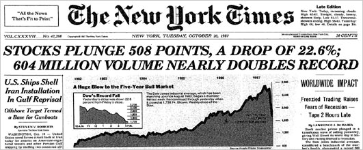
Tomorrow marks the twenty-sixth anniversary of the 1987 stock market crash. On October 19, 1987 the Dow Jones Industrial Average fell 22.6%, the largest one-day decline in stock market history. The best explanation for the decline, and the least well-known one, was put forth by economist Robert Shiller. This post gives a quick rundown of Shiller's work on understanding crash phenomena, in particular the famous 1987 event.

Eugene Fama, who along with Shiller and Lars Hansen shared the Nobel Prize this week, had very different reaction to the event than Shiller. In an essay penned not long after the crash, Fama, a true believer in the efficient market hypothesis, did his best to square the event with theory. The crash, wrote Fama,
has the look of an adjustment to a change in fundamental values. In this view, the market moved with breathtaking quickness to its new equilibrium, and its performance during this period of hyperactive trading is to be applauded. [Perspectives on October 1987, or What Did We Learn From the Crash? 1988]
Fama's effort to justify the crash as a rational response to economic news falls flat. A 22.6% decline requires something cataclysmic, but no significant events preceded the crash. Sure, there was a skirmish in the Persian Gulf with an Iranian oil station, a new tax proposal in the House, and a sell signal from guru Robert Prechter, but none of these events were capable of moving markets more than a few points.

Robert Shiller, on the other hand, gathered data. The day after the crash, he sent out questionnaires to hundreds of investors. Among other questions, Shiller asked: "Which of the following best describes your theory about the decline: a theory about investor psychology, or a theory about fundamentals such as profits or interest rates?" 67.5% of individual investors and 64% of institutional investors said the crash was about market psychology. When Shiller asked what major news stories people in his survey were reacting to during the day of the crash, the most popular stories were those about past price declines themselves, not fundamental news. Noted Shiller:
It would thus be wrong to say, as many have done, that the market drop on October 19, 1987 ought to be interpreted as a statement of public opinion about some fundamental economic factor, e.g., that there is a lack of confidence in the White House or Congress. At best, any such opinions probably played a role in the crash mainly as they affected the vague intuitive assessments people under great stress made about the tendency of prices to continue or reverse, or about how other investors will react to the current situation.
Put differently, the crash was a purely psychological phenomena.  When it comes to explaining the 1987 stock market panic, Fama and Shiller couldn't have been further apart.

 -----

Let me take this post on a personal tangent and then I'll circle back to Shiller. I first got interested in the 1987 crash back in the late 1990s when I was a student. Fearing that equity markets were getting overextended, I started to mine 1980s price data for clues about what might happen. I discovered that the visual overlay of movements in market indexes in the late 90s was eerily similar to that of the 80s. In October 1999 I went short, sure that we were on the verge of repeating the 1987 crash. At first the markets moved a bit lower. But a week or two later prices found their footing. I didn't know it then, but the bull move that followed would be the last spurt higher before tech mania would be pricked in early 2000. Unable to stomach the losses, I covered my shorts and went back to my studies.

Though I lost money in the debacle, I did gain what I thought was an interesting idea. If enough traders like myself drew analogies to a historical crash, our combined trades -- executed on the same day -- might result in the self-realization of that crash, even though nothing had fundamentally changed about the economy. This idea jived with an observation that many market watchers had made about the 1987 crash: it was eerily similar to the 1929 crash. Wrote George Soros:
Technically, the crash of 1987 bears an uncanny resemblance to the crash of 1929. The shape and extent of the decline and even the day-to-day movements of stock prices track very closely. -The Alchemy of Finance
Both crashes were preceded by multi-year bull markets. They each occurred on a Monday near the end of October, the first crash hitting 55 days after its bull market peak, the second 54 days. In addition to similar timing, the breadth of their declines were almost the same. The 1929 crash resulted in a 23% fall over two days, the 1987 in a 22.6% fall. I append a chart below:


Could it be that the 1987 crash occurred because traders were using the same backward-looking strategy I had when I went short in 1999? The process might have worked something like this, I reasoned: the peaks and troughs in 1987 began to randomly align with those in 1929. Backward-looking traders began to notice this alignment. A feedback loop may have emerged in which scattered fears of a recurrence of 1929 resulted in trades that pushed prices down, in turn rendering the analogy between the two periods ever more clear. A final trigger, say an anniversary date, might have been sufficient to complete the loop, resulting in a realization of the 1929 crash in 1987.

Reading through accounts of the 1987 crash, I found ample evidence of traders basing their strategies on 1929 analog models. In a famous but hard-to-come-by documentary filmed prior to the crash, 1980s wunderkind Paul Tudor Jones explained how he was using a 1929 analog model developed by his research director Peter Borish to put on a large short position in October 1987. The documentary is here, for now at least.* The Friday before the crash, hedge fund giant George Soros received a copy of Tudor Jones's study and showed it to Stanley Druckenmiller, manager of Soros's famous Quantum Fund.** On the morning of the crash, the Wall Street Journal published a chart of stock price in 1987 superimposed on stock prices leading up to the crash of 1929. News of the analog was spreading across Wall Street, and by Monday, October 19, enough momentum may have built for the analog to self-realize itself.

Paul Tudor Jones circa 1987

The 1929-87 event taught me that investor's minds don't react passively to underlying fundamental phenomena. Investors create stories that, when acted upon by enough people, actually shape the fundamentals. In 1987, a psychological "worm-hole" linked to an event fifty-eight years prior seems to have emerged, leading to the greatest one-day drop in market history. It was a mistake, a mental glitch, or a wrinkle in time.

 -----

Back to Shiller. I later found out that all of this had been anticipated by Shiller long before I was even old enough to buy and sell stock. In his post-1987 survey, Shiller found that 35% of individual investors and 53.2% of institutional investors reported talking of events of 1929 on the few days before October 19, 1987. Memories of 1929 were therefore "integral" in creating the 1987 crash, wrote Shiller:
Investors had expectations before the 1987 crash that something like a 1929 crash was a possibility, and comparisons with 1929 were an integral part of the phenomenon. It would be wrong to think that the crash could be understood without reference to the expectations engendered by this historical comparison. In a sense many people were playing out an event again that they knew well.
Nor was this the end to Shiller's work on crashes. The memory-of-crashes effect would reappear two years later. On Friday, October 13, 1989, a mini-crash occurred, the Dow falling 6.9%. Once again Shiller sent out a questionnaire. The most likely reason for the mini-crash, wrote Shiller, was the fact that the coming Monday was to have been the second anniversary of the 1987 crash.*** The mental image of the two biggest crashes in history possibly happening that Monday would have been sufficient to amplify any random price decline into an all-out panic. Wrote Shiller:
It may be a silly notion, but silly thoughts may have come to the minds of people trying to decide whether to sell as prices plummeted in the last hour of trading. They did not then have all of the reassuring commentary that came later, and they had to act then or risk having to sell on the following Monday. - Fear of the Crash Caused the Crash, NYT, 1989
 -----

In sum, Shiller long ago provided the world with what is probably the best explanation for why the 1987 crash happened when it did, and why it fell so far. Because Fama was so closely wedded to the EMH, his only option was to stay mute on the causes. "What caused this shift in expectations? I do not know" he wrote. Fama gives us a good-enough framework for understanding 99% of market moves. But for the remaining 1%, we really do need Shiller.


* The documentary has an interesting history. See Ritholtz, the WSJ, and Business Insider, among others. Apparently Tudor Jones threatens to sue anyone who puts it up, so getting ones hands on it is challenging. While the documentary is the best place to learn about the 1929 analog model, it also appears in the first edition of Jack Schwager's Market Wizards. But do try to watch the video, it's quite fascinating in its own right.


** Said Druckenmiller: "That Friday after the close, I happened to speak to Soros. He said that he had a study done by Paul Tudor Jones that he wanted to show me. I went over to his office, and he pulled out this analysis that Paul had done about a month or two earlier. The study demonstrated the historical tendency for the stock market to accelerate on the downside whenever an upward-sloping parabolic curve had been broken – as had recently occurred. The analysis also illustrated the extremely close correlation in the price action between the 1987 stock market and the 1929 stock market, with the implicit conclusion that we were now at the brink of a collapse. I was sick to my stomach when I went home that evening. I realized that I had blown it and that the market was about to crash." - Market Wizards, Jack Schwager (1988)

*** The 1929-87 analog revisited markets once again in 1997. On Monday, October 29, 1997, the Dow went into a freefall, eventually tumbling 7% . See my explanation of the 1987-1997 analog here

PS: If market's plunge this coming Monday, you know why.  ;) 

Monday, September 23, 2013

Ghost Money: Chile's Unidad de Fomento

Santiago skyline

This post continues on the topic of the separation of the medium-of-exchange function of money from the unit-of-account function. My previous post discussed how the medieval monetary order was characterized by both a medley of circulating coins and one universal £/s/d unit of account. This post introduces a modern example of medium-unit divergence: the Chilean peso and Chile's Unidad de Fomento. I'll explain how the Chilean system works and end off by asking some questions about the macroeconomic implications of this separation, specifically what happens at the zero lower bound.

Like most modern currencies, the peso is issued by the nation's central bank; the Banco Central de Chile. Local banks offer peso-denominated chequing and savings accounts. Chileans use these pesos as the nation's medium-of-exchange. They pay their bills with pesos, settle rent with it, and buy food with it.

The differences between Chile's monetary system and those of other nations only emerges when we begin look at the unit in which goods are priced. Most nations have one unit-of-account, but Chile has two. While many Chilean prices are expressed in terms of the peso, or P, a broad range of prices are expressed in an entirely different unit, the Unidad de Fomento, or UF. Real estate, rent, mortgages, car loans, long term gov securities, taxes, pension payments, and alimony are all priced using UF. As examples, this real estate website sets prices in UF terms, and this car rental business levies insurance in UFs. On the other hand, wages, consumer good prices, and stock prices are expressed in peso terms.

So what is the UF? The UF was introduced in 1967 by the Chilean government, though it only came into wide use as a unit-of-account in the 1980s. There are no UF coins or notes circulating in the Chilean economy. Rather, the Unidad de Fomento exists as a purely abstract, or indexed, unit-of-account, totally divorced from any media-of-exchange. Goods and services quoted in terms of the UF can only be purchased with an entirely different medium — pesos.

The UF is defined as the amount of currency units, or pesos, necessary for Chileans to buy a representative basket of consumer goods. The amount of pesos in one UF, or the peso-to-UF exchange rate, is calculated daily, and is published on the Banco Central's website. The daily value is interpolated from the previous month's consumer price index, or the Indice de Precios al Consumidor (IPC). If you go to this website, you can see the current peso-to-UF rate and how it has been adjusted over the last week.

This all sounds quite odd, so let's use an example to get a better idea for how the system functions. When a Chilean seller prices something in UF, they are indicating that they expect to receive a fixed quantity of CPI basket-equivalents as payment. For instance, say that a landlord advertises an apartment in downtown Santiago at a monthly rate of 10 UF. A potential renter, curious about the price, checks the UF-to-peso exchange rate at the central bank's website. He sees that today's rate stands at 23,000. Using a cellphone app (in real life, the rate will probably not be a convenient round number), he multiplies 10 UF x 23,000 P/UF to arrive at the current monthly rate in pesos, or 230,000P (this is about US$450). Deciding that the price is good, the renter signs a lease and starts to pay UF-denominated rent each month in pesos.

Say that the Banco Central adopts an easy money policy and six months later the Chilean peso's purchasing power has fallen by around 10%. Rent is still priced at 10 UF. But now the peso content of the UF has risen —after all, it takes about 10% more pesos to buy the same consumer basket. The computed rate on the central bank's website is now 25,000 P/UF. The monthly amount in pesos that the renter must make out to the landlord now comes out to 250,000P (10UF x 25,000 P/UF), up from 23,000. However, while the rent payment is nominally higher, the payment's UF value is constant. In other words, the transaction represents the exact same quantity of CPI baskets as six months before.

It works the same way when the with a tight money policy. Imagine a 10% peso deflation. The UF sticker price stays constant while the conversion rate to pesos on the central bank's website falls by 10%. Rent is nominally lower in peso terms but in terms of representative consumer baskets it has stayed constant.

The UF/P system is similar in many ways to a partially dollarized economy in which the US dollar has been adopted as the unit in which to price long term contracts while the local currency is used to price current goods and services. What makes Chile different from partially dollarized economies is that the dollar tends to circulate along with the local currency as a medium-of-exchange. Thus there are two different units-of-account corresponding to two different media-of-exchange. Chile's UF, on the other hand, is a purely abstract unit with no corresponding medium of its own.

Irving Fisher was skeptical of medium-unit divergence and declared so in his 1913 paper The Compensated Dollar:
Not only would the multiple standard necessitate much laborious calculation in translating from the medium of exchange into the standard of deferred payments, and back again but, if, as has been suggested, the employment of a multiple standard were at first optional, the result would be that many business men whose prosperity depended on a narrow margin between their expenses and receipts would be injured rather than benefited by having one side of their accounts predominantly in the actual dollar and the other in the ideal unit.
Fisher went on to propose his compensated dollar scheme, which was essentially a combined unit-of-account/medium-of-exchange dollar. The real purchasing power of the compensated dollar would stay constant over time, much like the UF/peso combination, but without the necessity of imposing the laborious calculations involved in medium-unit divergence. That Chileans did choose to adopt a somewhat laborious mechanism that involves conversion from/to pesos to/from the ideal UF demonstrates the degree to which they were willing to free themselves of the burdens imposed by the 1970s inflation of the peso. The practice of publishing the UF-to-peso rate on a daily basis—which began in 1977— may have also encouraged UF adoption. Prior to then, the UF had only been calculated monthly.

While the idea of separating the unit from the medium is not a common one, when it does arise it tends to have been inspired by the desire to avoid the deleterious effects of inflation. Widespread use of the UF, as pointed out earlier, came about as a response to 500%+ peso inflation of the 1970s. Robert Shiller, the most vocal modern advocate of unit/medium separation, has also been motivated by concerns over the deleterious effects of inflatio. Shiller believes that because people tend to succumb to money illusion when dealing with inflationary episodes, the adoption of indexed units-of-account may be the most palatable way to reduce the problem.

Just as interesting, however, is the idea of separating the unit-of-account and medium-of-exchange to help cope with deflationary episodes and the zero-lower bound problem

First, let's set up a hypothetical scenario without the UF and a combined peso unit-of-account and medium of exchange. Say the Chilean economy suddenly collapses. Pessimistic Chileans expect to earn a negative return on projects and investments. Peso cash provides a superior return in this environment since it pays 0%—hardly great, but 0% is better than -x%! Peso prices need to fall dramatically in order to restore equilibrium. Put differently, the value of the peso needs to rise to a level at which it is expected to decline at the same rate as all other projects and investments. Yet peso-denominated sticker prices are rigid, preventing the necessary adjustment. What should be a short period of sharp adjustment turns into a long painful period of high unemployment and idle resources.

Now let's assume that all prices are expressed in UF while actual transactions are conducted in pesos. The same shock hits the Chilean economy. Once again the negative yield on projects and investments is overwhelmed by the 0% yield on peso cash. Peso prices need to fall dramatically in order to equilibrate the peso's return with all other yields. As before, sticker prices are rigid.

Here's the difference between our first and second scenarios. In a world with an ideal unit-of-account and no related medium-of-exchange, it really doesn't matter that prices can't adjust. This is because prices are no longer expressed in terms of 0%-yielding peso cash. Rather, they are expressed in terms of UF. Because the UF lacks a physical counterpart, there are no equivalent UF instruments that might also hit the zero-lower bound. The peso's outsized 0% return relative to all other negative yielding assets, which before was the root of the problem, will be quickly equilibrated as the peso-to-UF exchange rate published on the central bank's website jumps higher.

So a shock to an economy in which a combined medium-of-exchange and unit-of-account prevails can quickly become a tragedy. The 0% nature of the former interferes with the stickiness of the latter. But when the medium-of-exchange is divorced from the unit-of-account, the 0% nature of the former will quickly be resolved since stickiness is now in terms of an ideal unit, and not in terms of pesos.

Medium/unit separation, it would seem, could be yet another foolproof way of escaping deflation and the zero-lower bound.


References:
1. Robert Shiller, Indexed Units of Account: Theory and Assessment of Historical Experience, 1997. [RePEc]
2. Robert Shiller, Designing Indexed Units of Account, 1998. [RePEc]
3. Robert Hall, Controlling the Price Level, 2002. [RePEc]
4. Stephen Davies, National money of account, with a second national money or local monies as means of payment: a way of finessing the zero interest rate bound, 2004

Friday, March 15, 2013

Beyond Buffett: Liquidity-adjusted equity valuation

One of the ironies of the stock market is the emphasis on activity. Brokers, using terms such as "marketability" and "liquidity," sing the praises of companies with high share turnover . . . but investors should understand that what is good for the croupier is not good for the customer. A hyperactive stock market is the pick pocket of enterprise. - Buffett

Our favorite holding period is forever -
Buffett
While Warren Buffett may not be fond of marketability, liquidity or short holding periods, the fact that stocks have moneyness—that they have varying degrees of liquidity—is vital to understanding stock prices. In this post I'll show why analysts can't ignore the liquidity factor when they try to evaluate whether today's S&P500 is over or undervalued.

With equity markets setting new highs by the day, the chorus of fundamental analysts shrieking "overvalued" is deafening. These analysts often buttress their point by an appeal to some sort of benchmark valuation metric, like Robert Shiller's cyclically adjusted price to earnings (CAPE) ratio. The "cyclical adjustment" bit refers to the fact that the divisor, earnings, has been smoothed over several cycles, in this case the last ten year's monthly earnings.

The average CAPE since 1881 has been about 16.5x. Today we are currently paying a hefty 22.9x for each dollar of cyclically-adjusted earnings. In order to return to the long run average of 16.5x, the S&P500 would have to plunge by around 28%. That's quite the bear market.

In the chart below I've flipped the cyclically adjusted P/E ratio upside down into an E/P ratio, or a measure of the S&P500's earnings yield. The earnings yield indicates what sort of cyclically-adjusted fundamental return investors might reasonably expect for each dollar they invest in the stock market. The yield currently clocks in at 4.4%, far below the historical median of 7.1%, and way lower than some of the more juicy returns of 10-15%.


The point that fundamental analysts take from this chart is this: why invest in stocks if they don't yield anything close to their long term average?

Adding liquidity to the valuation equation

The fundamental analyst's appeal to Shiller's CAPE ignores the fact that a stock yields not just a pecuniary earnings return, but also a non-pecuniary liquidity return. Stocks are moneylike—put differently, they have moneyness. This feature is valuable. The knowledge that a given good or asset will be relatively easy to sell in the future provides its owner with a degree of comfort. After all, if something unexpected happens to the owner—a tree falls on his house—he'll be able to quickly exchange away those liquid assets in order to get started on home repairs. Less liquid assets don't provide the same level of comfort. Their owner can never be sure that they'll be able to easily sell them should a tree fall, or a storm hit, or a car crash. Assets with higher degrees of moneyness provide greater discounted flows of comfort over time.

Because liquidity is a valuable property, any asset's return should be broken down into the pecuniary returns it provides (dividends + appreciation) and a liquidity return. The higher the liquidity return that an asset provides, the smaller the pecuniary return it need promise potential investors. For example, even though the pecuniary return on Federal Reserve notes is negative (ie. the market expects slow and steady inflation), people still hold notes because their liquidity return is so high. Or consider the difference between savings and chequing deposits. A savings deposit is frozen for a period of time whereas a chequing deposit is easily transferred. To compensate investors for foregoing the liquidity of chequing deposits, savings deposits need to provide higher pecuniary returns in the form of interest.

How high is a typical stock's liquidity return? Unfortunately I can't tell you since the ability to back out a stock's liquidity return from its overall return doesn't exist. While I won't hazard a guess about the current liquidity return on stocks, I'm pretty sure I know its shape over time. Due to institutional innovation, a modern stock's liquidity return is *far higher* than it was in the past. Put differently, stocks are more moneylike than ever.

Because they have been honed to provide ever higher liquidity returns, a modern day stock simply does not need to provide the investor with the same cyclically adjusted E/P yield that it did in the 1950s or 1960s. Just like a chequing deposit doesn't need to provide the same return as a savings deposit, today's stocks don't need to provide as much per-share earnings potential as yesterday's stock. This means that you should be very careful about mining Shiller's long term data for clues about present-day valuation since you'll be effectively comparing apples to oranges or, more correctly, illiquid shares to liquid shares.

Institutional changes increase the ease of transacting in shares

Here is a list of ways in which equity markets have evolved over time to increase the moneyness of equities.

1. Falling fees: Prior to 1975, the NYSE required that all members set minimum commission rates. Competitive pressures from over-the-counter exchanges (along with SEC pressure) finally convinced the NYSE board to deregulate commissions in 1975, the famous Mayday episode. In Canada, the changeover date was 1983. As the chart below shows, commissions plunged.

Figure from A Century of Stock Market Liquidity and Trading Costs - Jones (2002)

In addition to lower commissions, the emergence of competing exchanges like NASDAQ in 1971, and, more recently BATS, Direct Edge, and various dark pools, have led to ever lower exchange trading fees. Lower fees make it easier to get in and out of stock, rendering stock more useful as exchange media. A direct result of Mayday, for instance, was Charles Schwab and the discount brokerage boom, a phenomenon which dramatically increased the pool of investors and deepened liquidity in equity markets.

2. Collapsing bid-ask spreads: The influx of high-frequency traders has dramatically compressed the average spread between a stock's bid and ask price. But even before then, bid-ask spreads had been on a long term decline:

Figure from A Century of Stock Market Liquidity and Trading Costs - Jones (2002)

New practices like decimalization, implemented in Canada in 1996 and the US in 2001, have contributed to spread shrinkage. Stocks used to be quoted in eighths of a dollar. This was changed to sixteenths in 1997, but the practice of quoting in narrower fractions only meant that the minimum spread was now 6.25 cents rather than 12.5 cents. Decimalization allowed the spread in liquid stocks like MSFT to shrink to a cent or two. We're even seeing sub penny spreads these days, an impossibility just two decades ago.

Like lower commissions, narrower spreads make it easier to transact, therefore increasing the moneyness of stock.

3. Back-office changes: In the old days, stocks were traded in certificate form. When stock was exchanged, brokers employed "runners" to carry certificates from one broker to the other. In the late 1960s, to deal with backlogs, certificates began to be immobilized at central repositories. All trades were transferred by book entry, a far easier process than before. Nowadays, certificates are being dematerialized, meaning that they are being converted into digital form. All this makes trade in stock safer, more convenient, and cheaper.

In the 1930s, the convention was to settle stock trades five days after trade day, or T+5. We are now at T+3 and moving to T+1, or straight-through processing. Again, the trade process is speeding up.

4. Standardization and transparency: The increasing adoption of universal accounting standards and practices have increased the quantity, quality, and comparability of information emitted by public issuers. Investor relations departments of listed firms are far more concerned than in times past about the equitable distribution of information. Insider trading, while illegal in the US since 1934, has become increasingly frowned upon in practice. Equity research has become more formalized, ensuring that information is more efficiently processed.

As a result of all these changes, the perception (if not the reality) exists that the stock market is no longer the loaded game of yore, when investors were typically pitted against a clique of operators with inside information and tight control of a company's float. Rather, the modern day stock market offers a flat playing field. This homogeneity and verifiability has set the stage for stocks to become more moneylike.

5. Longer trading days: The NYSE used to open at 10 a.m. and close at 3 p.m, an easy five hour trading window. While the Exchange also opened on Saturday morning, the window was only for two-hours, a practice that ended in 1952. Nowadays, NYSE ARCA, the NYSE's electronic trading platform, opens at 4:00 AM and closes at 8:00 PM.

Due in part to all these changes, share velocity has exploded. Put differently, the average holding times of NYSE stock has plunged from 8 years in the 1960s to around 12 months today:


Liquidity-adjusted fundamental analysis

Fundamental analysts, who frame investment decisions as if they'll own a stock forever, dislike this trend. To them, the equity market's increase in velocity, combined with a 23x PE ratio, represents a maddening increase in silly speculation. All they can do is sit on the sidelines and snipe.

On the contrary, the rapid increase in share velocity isn't silly, it simply reflects the market's growing willingness to treat stock like cash on the back of constant institutional innovation. Cash is useful because it is liquid and can get you out of a bind. Same with modern-day stock. Rather than treat high PE ratios and the increasing velocity of stock as products of irrationality, fundamental analysts need to understand that the premium put on liquidity is the market's reward for a very real transactional service provided by stock. What should fundamental analysts do? Stop trying to figure out if a stock is overvalued or not. Rather, try and find out if that portion of a stock's value not attributable to liquidity is overvalued or not. Or, put differently, try to strip out the liquidity return provided by a stock in order to focus purely on the real return. This amounts to calculating a liquidity-adjusted CAPE. But that's a post better left for next month!

Summing up...

A stock today is not your grandfather's stock. Stock can do more moneyish and cashlike things. It can be exchanged faster, safer, and cheaper. Because such a large chunk of a modern stock's returns now arise from their moneyness, fundamental analysts shouldn't be using earnings yields from the 1900s, let alone the 1800s, as a baseline for estimating modern yields. As long as the decades-long process of liquefying stock continues, it's very likely that the market will never again require stock to provide 7.1% returns. Today's 4.4% yield might be more normal than most think.

[This post is continued at If your favorite holding period is forever]