Showing posts with label System of National Accounts. Show all posts

Monday, July 21, 2014

Fedwire transactions and PT vs PY

Milton Friedman's alleged license plate, showing the equation of exchange

The excruciatingly large revisions that U.S. first quarter GDP growth underwent from the BEA's advance estimate (+0.1%, April 30, 2014) to its preliminary estimate (-1.0%, May 29, 2014) and then its final estimate (-2.9%, June 25m, 2014) left me scratching my head. Isn't there a more timely and accurate measure of spending in an economy?

One interesting set of data I like to follow is the Fedwire Fund Service's monthly, quarterly, and yearly statistics. Fedwire, a real time gross settlement interbank payment mechanism run by the Federal Reserve*, is probably the most important financial utility in the U.S., if not the world. Member banks initiate Fedwire payments on their own behalf or on behalf of their clients using the Fedwire common currency: Fed-issued reserves. Whenever you wire a payment to another bank in order to settle a purchase, you're using Fedwire. Since a large percentage of U.S. spending is transacted via Fedwire, why not use this transactions data as a proxy for U.S. spending?

Some might say that using Fedwire data is an old-fashioned approach to measuring spending. Irving Fisher wrote out one of the earliest versions of the equation of exchange, MV=PT, where T measures the "volume of trade" or "real expenditure" and P is the price at which this trade is conducted. Combined together, PT amounts to the sum of all exchanges in an economy. More specifically, Fisher's T included all exchanges of goods where his chosen meaning for a good was broadly defined as any sort of wealth or property. That's a pretty wide net, including everything from lettuce to publicly-traded equities to land.

Practically speaking, Fisher wrote that it was "utterly impossible to secure data for all exchanges" and therefore his statistical approximation of T was limited to the quantities of trade in 44 articles of internal commerce (including pig iron, rice, hogs, boots & shoes), 23 articles of import and 25 of export, sales of equities, railroad freight carried, and letters through the post office. This mishmash of items included everything from wholesale goods to securities to and consumption goods. Using Fedwire transactions to track total spending is very much in the spirit of Fisher, since any sort of transaction can be conducted through the interbank payments system, including financial transactions.

Nowadays we are no longer taught the Fisherian transactions version of the equation of exchange MV=PT but rather the income approach, or MV=PY. What is the difference between the two? Y is a much smaller number than T. This is because it represents GDP, or only those goods and services that are qualified as final, where "final" indicates items bought by a final user. T, on the other hand, includes not only the set of final goods and services Y but also all spending on second hand goods, stocks and bonds, existing homes, transfer payments, and more. Whereas GDP measures final goods in order to avoid double counting, T measures final and intermediate goods, thus counting the same good twice, thrice, or even more if the good changes hands more often than that.

A good illustration of the difference in size between Y and T is to chart them. The total yearly value of Fedwire transactions, which are about as good a measure of PT that we have (but by no means perfect), exceeds nominal GDP (or PY) by a factor of 40 or so, as the chart below shows. Specifically, nominal GDP came in at $17 trillion or so in 2013 whereas the total value of Fedwire transactions clocked in at $713 trillion.


So why do we focus these days on PY and not Fisher's PT? We can find some clues by progressing a little further through the history of economic thought to John Keynes (is it a travesty to omit his middle name?). In his Treatise on Money, Keynes was unimpressed with Fisher's cash transactions standard, as he referred to it, because PT failed to capture the most important human activities:
Human effort and human consumption are the ultimate matters from which alone economic transactions are capable of deriving any significant; and all other forms of expenditure only acquire importance from their having some relationship, sooner or later, to the efforts of producers or to the expenditure of consumers.
Keynes proposed to "break away from the traditional method" of tabulating the total quantity of money "irrespective of the purposes on which it was employed" and focus instead on the narrow range of trade in current consumption and investment output. Keynes's PY measure (the actual variables he chose was PO where O is current output) would be a "more powerful instrument of analysis than their predecessor, when we are considering what kind of monetary and business events will produce what kind of consequences."

And later down the line, Milton Friedman, who renewed the quantity theory tradition in the 1950s and 60s, had this to say about the shift from PT to PY:
Despite the large amount of empirical work done on the transactions equations, notably by Irving Fisher and Carl Snyder ( Fisher 1911 pp 280-318, Fisher 1919, Snyder 1934), the ambiguity of the concept of "transactions" and the "general price level", particularly those arising from the mixture of current and capital transactions—were never satisfactorily resolved. The more recent development of national income accounting has stressed income transactions rather than gross transactions and has explicitly and satisfactorily dealt with the conceptual and statistical problems of distinguishing between changes in prices and changes in quantities. As a result, the quantity theory has more recently tended to be expressed in terms of income rather than of transactions
So there are  evidently problems with PT, but what are the advantages? Assuming we use Fedwire transactions as the proxy for PT (and again, Fedwire is by no means a perfect measure of T, as I'll go on to show later) the data is immediate and unambiguous. It doesn't require hordes of government statisticians to laboriously compile, recompile, and check, but arises from the regular functioning of Fedwire payments mechanism. There are no revisions to the data after the fact. And rather than being limited to periods of time of a month or a quarter, there's no reason we couldn't see Fedwire data on a weekly, daily, or even real time level of granularity if the Fed chose to publish it.

Even Keynes granted the advantages of PT data when he wrote that the "figures are available promptly without the necessity for any special calculation." In Volume II of his Treatise, he took U.S. "bank clearings" data (presumably Fedwire data), and tried to remove those transactions arising from financial activity by excluding New York City, the nation's chief financial centre, thus arriving at a measure of final spending that came closer to PY.

What are the other advantages of PT? While PT counts second-hand and existing sales, might that not be a good thing? Nick Rowe, writing in favour of PT, once made the point that it's "not just new stuff that is harder to sell in a recession; it's old stuff too. New cars and old cars. New houses and old houses. New paintings and old paintings. New furniture and antique furniture. New machine tools and old machine tools. New land and old land." As for the inclusion of financial transactions, anyone who thinks asset price inflation or deflation is an important property of the economy (Austrians and Austrian fellow travelers no doubt) may prefer PT over PY since the latter is mute on the subject.

I'd be interested to hear in the comments the relative merits and demerits of PY and PT. Why don't the CNBC talking heads ever mention Fedwire, whereas they can spend hours debating GDP? Why target nominal GDP, or PY, when we can target PT?

For now, let's explore the Fedwire data a bit more. In the figure below I've charted the total value of Fedwire transactions (PT) for each quarter going back to 1992. I've overlaid nominal GDP (PY) on top of that and set the initial value of each to 100 for the sake of comparison.


It's evident that the relative value of Fedwire transactions has been growing faster than nominal GDP. However, the financial crisis put a far bigger dent in PT than it did PY. Only in the last two quarters has PT been able to break to new levels whereas nominal GDP surpassed its 2008 peak by the second quarter of 2010. Is the financial sector dragging down PT? Or maybe people are spending less on used goods and/or existing homes?

Fedwire data is further split into price and quantity data. Below I've plotted the number of transactions, or T, completed on Fedwire each quarter. On top of that I've overlaid real GDP, or Y. The initial value of real GDP has been set to 16.6 million, or the number of transactions completed on Fedwire in 1992.


After growing at a relatively fast rate until 2007, the number of transactions T being carried out on Fedwire continues to stagnate below peak levels. In fact, last quarter represented the lowest number of transactions since the first quarter of 2012, a decline that coincided with the atrocious first quarter GDP numbers.

Finally, below I've plotted the average value of Fedwire transfer by quarter. On top of that I've overlaid the GDP deflator. To make comparison easier, I've taken the liberty of setting the initial value of the deflator at the 1992 opening value for Fedwire transaction size.


As the chart shows, the average size of Fedwire transfers really took off in 2007, peaked in late 2008 then stagnated until 2013, and has since re-accelerated upwards. In fact, we can attribute the entire rise in the quarterly value of transactions on Fedwire (the second chart) to the growth in transaction size, not the quantity of transactions. Fedwire data is telling us that inflation of the PT sort has finally reemerged.

A few technical notes on the Fedwire data before signing off. As I've already mentioned, Fedwire provides a less-than complete measure of PT. To begin with, it doesn't include cash transactions (GDP does, or at least those that have been reported). This gap arises for the obvious reason that cash transactions aren't conducted over Fedwire. Nor do cheque transactions appear on Fedwire, or at least they do so only indirectly. Check payments are netted against each other and canceled, with only the final amounts owed being settled between banks via Fedwire, these settlements representing just a tiny fraction of the total value of payments that have been conducted by check over any period of time.

The same goes for securities transactions. Fedwire data underestimates the true amount of financial transactions because trades are usually netted against each other by an exchange's clearing house prior to final settlement via Fedwire. The transfer of reserves that enables the system to settle represents a small percent of the total value of trades that have actually occurred.

Another limitation is that Fedwire data doesn't include wire payments that occur on competing payment systems. Fedwire isn't a monopoly, after all, and competes with CHIPS. I believe that once all CHIPS payments have been cleared, final settlement occurs via a transfer of reserves on Fedwire, but this final transfer is a fraction of the size of total CHIPS payments. And finally, payments that occur between customers of the same bank are not represented in the Fedwire data. This is because these sorts of payments can be conducted by a transfer of book entries on the bank's own balance sheet rather than requiring a transfer of reserves.

I'm sure I'm missing other reasons for why Fedwire data undershoots PT, feel free to point them out in the comments. Do Fedwire's limitations cripple its value as an indicator PT? I think there's still some value in looking at these numbers, as long as we're aware of how they might come up short.

Some links:
1. Canadian Large Value Transfer System Data, the Canadian equivalent to Fedwire
2. A paper exploring UK CHAPS data,the British equivalent to Fedwire: Income and Transactions Velocities in the UK

* 'Real time' means that payments are immediate and not subject to delay, while 'gross settlement' indicates that payments are not grouped together for processing but submitted individually upon being entered. Fedwire gets its name from the beginning of the last century, when payments were carried out over the wires, or the telegraph system. 

Sunday, June 29, 2014

It was the best of times, it was the worst of times


You may know by now that the final revision of U.S. first quarter GDP revealed a shocking 2.9% decline while its mirror image, gross domestic income (GDI), was off by 2.6%.

As Scott Sumner has pointed out twice now, the huge decline in GDI is almost entirely due to a fall in corporate profits. Whereas employee compensation, the largest contributor to GDI, rose from $8.97 to $9.04 trillion between the fourth quarter of 2013 and the first quarter of 2014, corporate profits fell from $2.17 to $1.96 trillion (see blue line in the above chart) This incredible $198 billion loss represents a 36% annualized rate of decline!

A number of commentators have pointed out the difficulty in squaring this data bloodbath with reality. After all, Wall Street has not been announcing 36% quarter on quarter profit declines. Rather, earnings per share growth has been pretty decent so far this year. If earnings were off by so much, then why are equity markets at record highs? Why have there been no layoffs? It's hard to believe that a bomb has gone off when there's no smoke and debris. Investors are patting themselves down to make sure they had no wounds or broken body parts and, coming up clean, are shrugging and buying more stocks.

I'm going to argue that the odd disjunction between the numbers and reality may have arisen due to something called money illusion. We live in a historical-cost accounting world in which stale prices are used as the basis for much of our profit and loss calculations. But the gunshot rang out in a different universe, one in which accountants rapidly mark costs to market. At some point we in the historical-cost world will feel the repercussions of the gunshot since everything is eventually marked to market. For now, however, no one seems to have noticed because we're all caught up in an the illusion created by accountants focused on the ghost of prices past.

More specifically, the folks at the Bureau of Economic Analysis who compile GDI report a different corporate profit number than the profit numbers being bandied around on Wall Street during earnings season. Wall Street profits are by and large paid out after depreciation expenses, and these have been accounted for on a historical-cost basis. This is the red line in the above chart. The BEA's number, represented by the blue line in the chart above, represents the profits that remain after depreciation expenses have been marked to market. The choice between mark-to-market depreciation accounting and historical-cost accounting can result in large differences in bottom-line profit, as the last data point in the chart illustrates.

For instance, consider a manufacturing company that earns revenues of $100 per year from a machine that it bought for $600. It depreciates the machine by $60 each year over 10 years, earning a steady $40 in profits ($100 - $60). Now imagine that all over the world machines of this type are suddenly sabotaged so that, due to their rarity, the cost of repurchasing a replica doubles to $1200. If the manufacturing company uses historical cost deprecation, it will continue to bring in revenues of $100 a year, deducting the same $60 in depreciation to show $40 in earnings. All is fine in the world. But if the firm uses mark-to-market depreciation, the cost of using up the machine will now reflect the true cost of replacing it: $120 a year ($1200/10 years). Subtracting $120 from the annual $100 in revenues means the company is losing $20 a year, hardly a sign of health.

It's easy to work out an example that shows the opposite, how a glut in machinery supply (which would drive the replacement cost of the machine down) is quickly reflected in a dramatic improvement in earnings after mark-to-market depreciation expenses, but earnings after historical-cost depreciation show nothing out of the ordinary.

Thus we can have one profit number that tells us that all is fine and dandy, and another that indicates the patient is on death's door. An individual's perception of the situation depends on which universe they live in, the historical cost universe or the mark-to-market one. The GDI explosion has gone off in the latter (the BEA uses a mark-to-market methodology), but since we experience only the former (the Wall Street earnings parade is entirely a celebration of historical-cost earnings per share data) we haven't really felt it... yet.

Yet? Even a company that lives in a historical cost accounting universe will eventually have to face the market price music. Imagine our sabotage example again. If our company uses mark-to-market accounting, it will immediately know it is facing a problem since its $100 revenue stream is failing to offset the $120 cost of machinery depreciation. However, if it uses historical cost accounting then our company continues to enjoy what it perceives to be a revenue stream that more than offsets its historically-fixed $40 cost of machinery. However, once that machine inevitably breaks down and needs to be replaced with a $1200 machine, a new historical cost base will be established and depreciation will suddenly rise to $120. Several quarters too late the company will realize that it is now operating in the red. Had it marked deprecation to market, that realization would have come much sooner.

If I had to speculate, here's a more detailed story about the last quarter. US corporate revenues were particularly underwhelming between Q4 2013 and Q1 2014 due to the cold weather. At the same time, we know that a number of government stimulus acts that had introduced higher than normal historical cost depreciation allowances (this allows firms to protect their income from taxes) were rolling off. Flattish revenues were therefore offset by smaller deprecation costs, resulting in a decent bump to headline earnings numbers, as the red line in the chart shows. Everything looked great to majority of us who inhabit the historical cost accounting universe.

However, mark-to-market depreciation accounting used by the BEA strips out the effect of the expiring depreciation allowances, thereby removing the bump. The combination of flattish revenues and higher market-based depreciation expenses (perhaps due to some inflation in the cost of capital goods) would have conspired to create a fall in the blue earnings series, and therefore a groaningly bad quarter in our mark-to-market universe.

In any case, the crux of the issue is that Wall Street's headline numbers indicate that corporate America did a better job in the first quarter of 2014 generating the cash necessary to replace worn out capital than it did in Q4 of 2013. The BEA numbers are telling us the opposite, that corporate America did a poorer job of covering the costs of wear & tear. Neither of the two numbers is wrong per se, but as I've already point out in my example, mark-to-market methodology is the first to reveal problems while historical cost accounting will follow after a lag.

As I've already hinted, the fact that Wall Street hasn't yet noticed that it just lived through a miserable quarter can be attributed to money illusion: a phenomenon whereby people focus on nominal rather than real values. In this specific instance, investors are so obsessed with headline changes in earnings that they fail to adjust that number for the true cost of using up machinery. Irving Fisher himself described a version of this mistake in his book The Money Illusion:
...during inflation the cost of raw materials and other costs seem to be lower than they really are. When the costs were incurred the dollar was worth more than it is later when the product is sold, so that the dollars in the original cost and the dollars in the later sale are not the same dollars. The manufacturer is deceived just as was the German shopkeeper or the Austrian paper manufacturers who thought they were making profits.
How likely is it that Wall Street, full of so many bright individuals, is being fooled by money illusion? It's not inconceivable. Even Scott Sumner volunteers that he doesn't believe the BEA's numbers due to soaring stock prices and strong earnings, thus falling prey to that very same affliction that serves as his blog's namesake. Money illusion can happen to the best of us.

Sunday, October 14, 2012

Do credit-induced asset price bubbles show up in GDP?


Having read Larry White's book on free banking (pdf) and a number of George Selgin's papers I consider myself to be an advocate of free banking. That being said, I can't help but wonder about a few of George's recent points in his post on Intermediate Spending Booms, the most recent in a series of posts that trains a critical eye on market monetarists. Here is George:
But in seeking to free monetary theory and policy from the Keynesian overemphasis on interest rates, the Market Monetarists tend to downplay the extent to which central banks can cause or aggravate unsustainable asset price movements by means of policies that drive interest rates away from their "natural" values. Such distortions can be significant even when they don’t involve exceptionally rapid growth in nominal income, because measures of nominal income, including nominal GDP, do not measure financial activity or activity at early stages of production.
George is saying that nominal GDP might not properly capture the effects of a central bank setting its rates below the natural rate because it doesn't measure a few key variables, namely financial activity and early-stage investment projects. This sounds somewhat like a rechristening of the classic Austrian complaint against traditional measures of inflation. Here, for instance, is an article by Bob Murphy talking about how relatively tepid changes in CPI might mask credit-induced asset bubbles.

As I pointed out in my comment on George's blog, GDP calculations include investment, presumably much of which is in the early stages of production. GDP also includes inventories. Bill Woolsey describes this better than I can.

As for changes in financial activity due to excess credit, I think GDP should capture it pretty quickly. The next little bit is just a paraphrasing of Fritz Machlup's The Stock Market, Credit, and Capital (pdf). Machlup wrote it to counter claims that the stock market was capable of "tying up capital". It's a great read.

Fritz Machlup
Say artificially low interest rates convince a speculator to borrow from a bank in order to fund the purchase of a stock. When the transaction is completed the speculator owns the stock. On the opposite side of the transaction, the seller of the stock has been freed of her position and owns cash. She in turn can do two  things with this cash. First, she might buy goods. This will immediately show up in GDP. Alternatively, she can buy another stock, in which case a third person now owns the cash. This third person can in turn either buy goods, which registers in GDP, or purchase new stock from a fourth person. This fourth person can.... you get the point. The process proceeds fairly quickly until someone in the chain purchases a good, thereby allowing GDP to capture the effect of excess credit.*

Another factor limiting the ability of long chains of stock transaction to tie up capital is that the longer the chain continues, the more likely stock prices are to be bid up. At higher prices, firms are more willing to finance themselves by issuing new shares since their cost of capital has fallen. This is because they can raise more today than the day before while issuing the same amount of shares. When firms issue new shares they drain the purchasing power originally created by excess credit creation out of the market and invest it in new capital. This allows GDP to ultimately capture the effect.

So a decline in market rates below the natural rate will result in more credit, and this credit could very well be used to purchase stocks, and this will put upward pressure on prices. But just as quickly as credit is used to buy stocks, purchasing power is released from the stock market as the sellers of stocks use the proceeds to buy real goods. GDP measures will capture the effect. I think this process happens fairly quickly given the agileness of financial markets. Maybe George thinks these chains can persist for some time.

One interesting side note. Say that the purchasing power created by excess lending exits the stock market when someone in the chain purchases used goods, say an old couch. Second hand goods transactions are not included in GDP calculations. So in this case, the effects of excess credit might not show up in GDP. It's for this reason that Nick Rowe  prefers the value of total transactions ( P x T) to nominal GDP (P x Y) as his choice indicator. Incidentally, George too invokes the idea that measures of transactions might be better indicators of monetary conditions than income measures:
When interest rates are below their natural levels, spending is re-directed toward those earlier stages of production, causing total nominal spending (Fisher’s P x T) to expand more than measured nominal income (P x y) 
It would seem then that market monetarists like Nick Rowe and Selgin do have some things in common.

*There is a third thing that can be done with the cash. It can be held. But if people do this, then the issuing bank never issued excess credit in the first place. Sufficient demand already existed in the economy for bank liquidity and this is expressed by the fact that people willingly decide to hold those newly created deposits.

Thursday, May 17, 2012

GDP totalitarianism: Krugman's mischaracterization of Japan's plight as "star performance"

Paul Krugman points to Japan's apparent resurgence in GDP and asks: "There seems to be some kind of lesson here about macroeconomics, but I can’t quite put my finger on it …"

My comment:
The lesson here is that one needs to be careful when trying to understand natural disasters using flow-based identities like Y=C+I+G. The latter fails to account for large draw-downs in national wealth due to, say, tsunamis. Using a stock identity, and stock related data like national net worth, will be more helpful in this situation.
For a proper accounting treatment of Japan's experience, Krugman should refer to the 722 page UN System of National Accounts Manual (pdf). Krugman wants to use the production accounts for his analysis, which are represented as flows. He should be using the wealth account, in particular new worth, which is a stock. The tsunami will have resulted in a large fall in Japan's net worth. This is elementary, so I don't know why a Nobel-prize winning economist wouldn't know this.

I agree with Nick Rowe that GDP has a totalitarian grip on our way of economic thinking.

Saturday, January 14, 2012

Debt, generations, savings, and economic categorization or the "Borges Problem"


I didn't comment much on the great debt debate, stirred up a Krugman post called Debt Is (Mostly) Money We Owe to Ourselves, but followed it quite closely.

Nick Rowe taught me (here, here, here, and here), and Bob Murphy clarified (here, here, here, here, here, here, here, and here), that present generations can indeed take resources from future generations via debt issuance.

I also learnt via Daniel Kuehn here and here that if you use a very unintuitive definition of "generations", than this is not the case. Basically, you can swap the meanings of terms to argue your way out of a tight spot.

My comment is from a Murphy post:
I’ve learnt that the method by which one aggregates individuals into groups, and the labels that one attaches to such groups, can have an important influence on a debate’s ability to reach resolution. If people are aggregating differently, and using non-standard words for their categories, then the debate will degenerate into shouting matches.
In a comment on a post called Why "saving" should be abolished, Nick describes this as the Borges Problem, which I rather like. Says Nick,
Let me first do one general response:
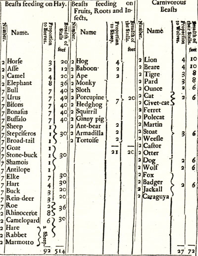
 There are lots of different ways we can divide up the world into categories see Borges on "animals" http://en.wikipedia.org/wiki/Celestial_Emporium_of_Benevolent_Knowledge%27s_Taxonomy
 Which would be the most useful way to divide up income, and define saving?
 Which of these 3 definitions of desired saving is the most useful?
Nick later on:
Notice also that the recent debate about the burden of the debt was also an example of the "Borges Problem". Do we divide the future up into time periods or into cohorts? We get very different results depending on how we categorise the world. And sometimes the categories we use are chosen by someone long ago who had a totally different purpose and/or a totally different theory to ours. Our way of seeing the world gets distorted by the dead hand of historical ways of seeing.
Yes! I did notice that. It caused me a lot of confusion. Nick also notes that the solution is to choose the most useful categorization out of all possible options, and proceeds to advocate a different category to which we should attach the word "savings". Interesting stuff. I'm not sure how Nick proposes we solve for "usefulness" though. Isn't the fact that almost everyone uses the same term for a given categorization a good enough claim for usefulness?

Here's another Rowe comment on Kuehn's blog which is relevant:
Put it another way: there's more than one way to aggregate. We shouldn't let our theories of what is happening in the world be determined by the choices made by long-dead National Income Accountants.
Anyways, in my comment on Nick's savings post, I proposed a more useful (at least to me) Borgian response to the categorization problem. Instead of categorizing the world on the basis of flows, categorize it as a series of balance sheets, or stocks. The result is that consumption, investment, and savings are all attached to entirely different bins (and more intuitive ones, to me at least) than in a world composed in terms of flows:
Nick, I agree with you that the conversation on debt was mainly about categorizations and the lack of standardized terms associated with categorizations. That made it very frustrating to follow.
So I am all in favor of standardizing terms, as you advocate in this post. 
I noticed you originally introduced C and I as flows and A and M as stocks. Then when you brought in the individual's economy, you introduced not a stock of antique furniture, but a flow of antiques, and not a stock of money, but a flow of money. Presumably you did this to preserve stock flow consistency.
The idea of a flow of antiques or money is very unintuitive to me. Why not go the other way? Not flows of consumption and investment, but stocks? Thus you have and individual's goods C, I, A, and M, which are all stocks. Sum them all up and you have S (the noun form of S, not the verb). This S can rise or fall. As a solution to the Borgian categorization problem, this configuration makes more intuitive sense to me.
And later:
N: "but if we think of income as a flow, then thinking of C and I as stocks is going to create problems."
 Me: You start out with the C and I that you have produced in your stock of assets, hold this C and I until you find someone who'll exchange for them with the M they have in their stock of assets. Now they are holding C and I and you are holding M. So here income isn't a flow, it's just a trade, an instantaneous swap of assets held in a portfolio.
 How much of economics is taken up by definitional debates and confusion? You'd think there would be a universal set of definitions for economic terms somewhere so these issues don't pop up. When I read William Hutt's books I'm always pleased because he uses his first chapter to explicitly define every term he'll be using.
and once more *phew*:
N: "Will those trades all take place in an instant, with some buying and some selling a stock of antiques? Or will those trades happen slowly over time, as people buy or sell a flow of antiques, and slowly get back to their long run desired stocks? That depends. If antiques are a small part of your wealth, and the market is frictionless with all antiques identical and so zero search costs (obviously not, for antiques). Each person would instantly buy or sell a stock of antiques to get back to his personal desired stock. Otherwise, there will be a flow of trades. If antiques are a large fraction of your wealth, you may only buy and sell slowly, in a flow."
 me: Ok, thinking in a world with stocks, (an infinite series of balance sheets), trades still happen in an instant, even if you introduce search costs. You hold the antique on your balance sheet until you don't. The antique is in your hand up until the moment it enters the hand of the buyer.
 Introducing frictions means that someone can have the intention of selling that antique and will need to incur costs to search out someone to trade. But it doesn't mean the process must be a conceptualized as a flow. Rather, the intention of selling an antique just moves the antique to a different part of an individual's balance sheet. It continues to lie in the asset column of their balance sheet, but is moved from long-term assets to current or liquid assets. Introducing search costs means that instead of an interval of two balance sheets before a swap occurring, the interval is some number larger than two.
My rough final thoughts are that thinking in terms of stocks, not flows, introduces a number of important categories that flow-based economics ignores because it is focused on flows. The most important of these is a stock of non-durable consumption goods. In flow-based economics, it's always been odd to me that factories produce, and we instantaneously use up, consumption goods.

A stock based world also is terribly confusing way to go about things, because the word savings in a flow-based world is attached to a different category than that which it is attached to in a stock based world, much like how in the Great Debt debate the word "our children" can be attached to either a period of time or a cohort.